The Anatomy of a Brand.
I like to think of a brand almost like a body. There are the parts you notice first, and then there’s everything underneath holding them together.
Before I start designing, I want to understand what something is trying to say. Who is it speaking to? How should it make someone feel? What does it need to do — not just look like?
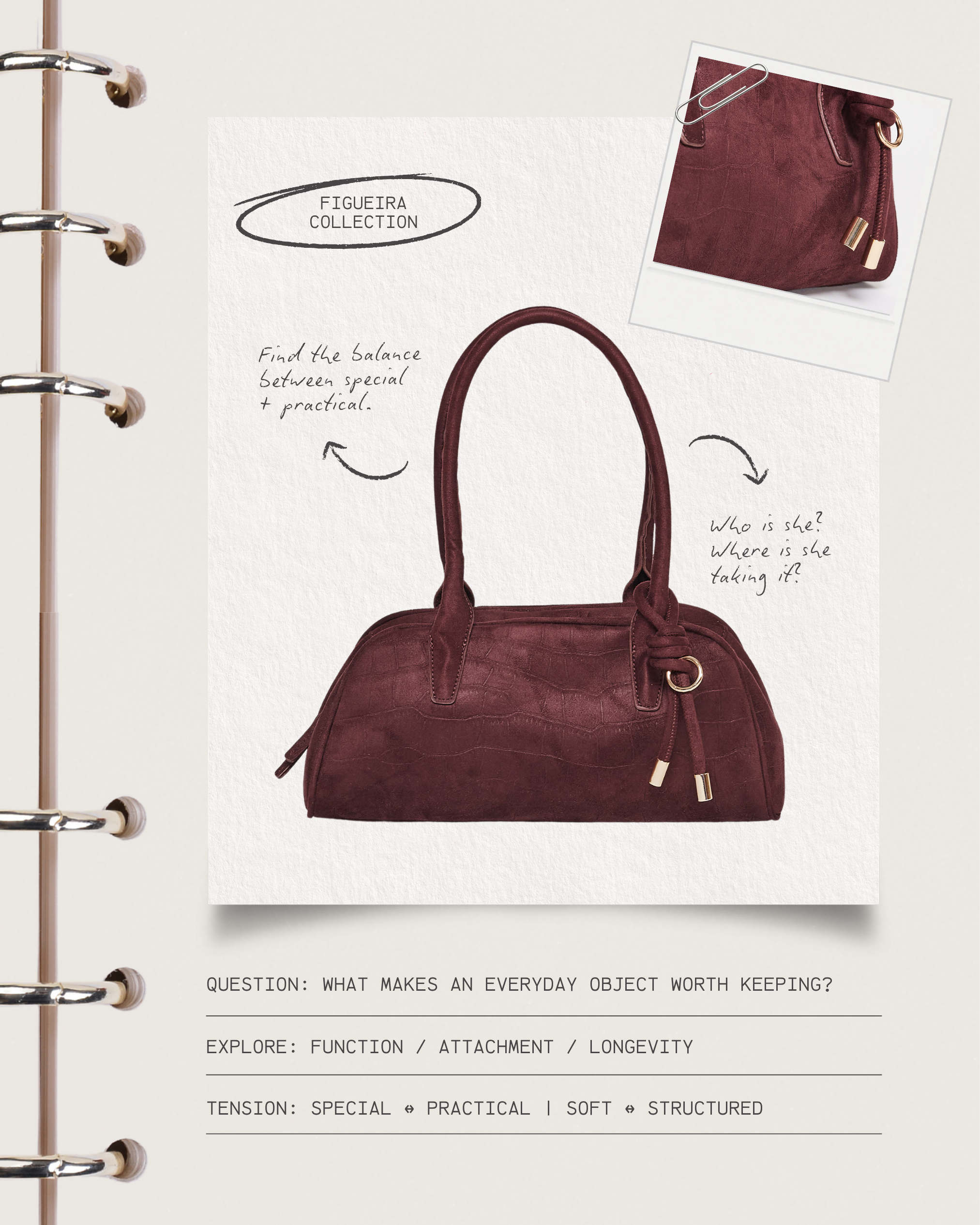
THE BONES = THE STRATEGY The part that gives everything else structure. The idea, the purpose, the audience, the positioning, the personality. This stage holds the decisions together.
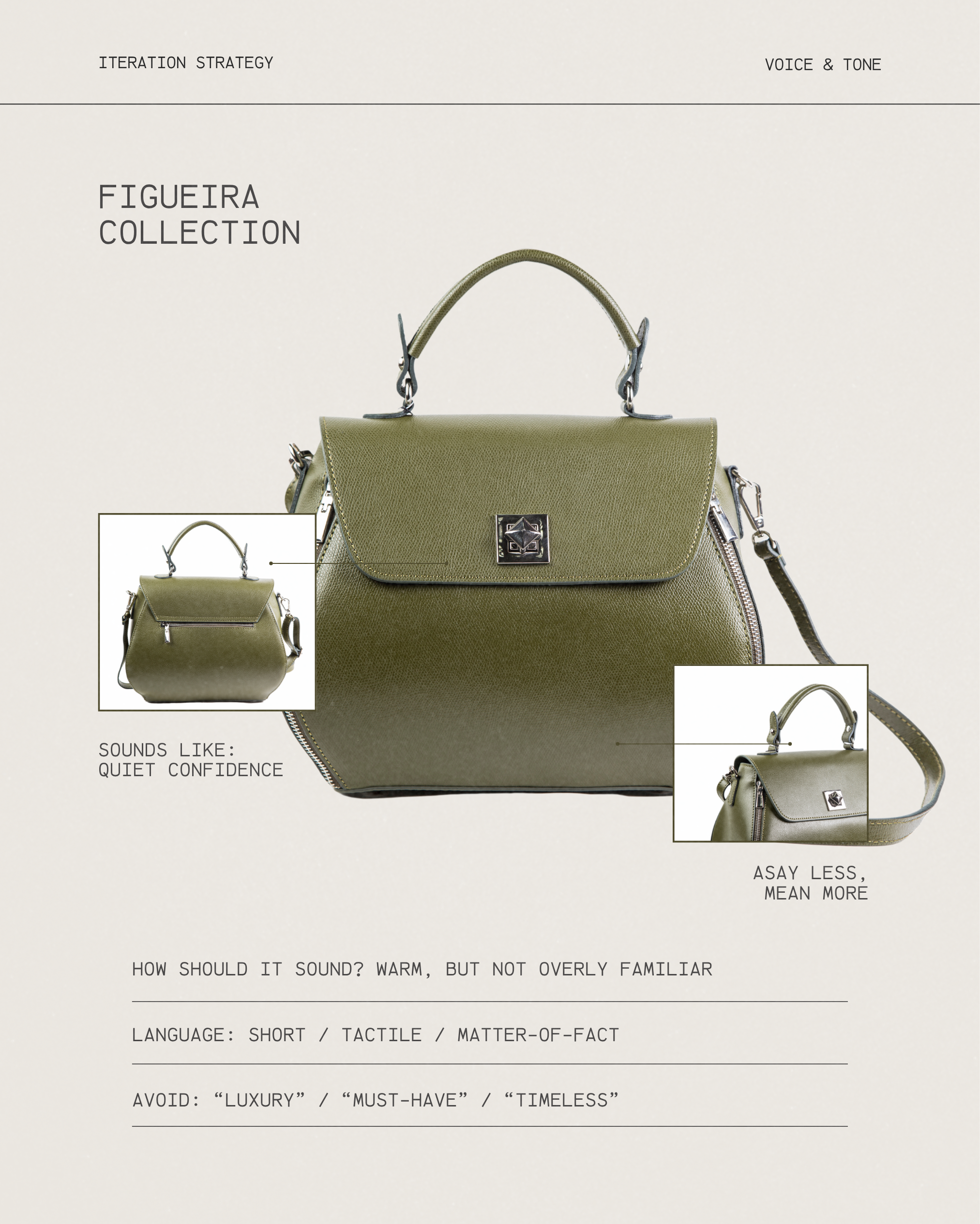
THE VOICE = HOW THE BRAND SPEAKS The words on a website, a caption, packaging, an email, even the tiny sentence underneath a button all contribute to how we understand a brand. A brand can be warm without being playful. Minimal without being cold. Elevated without sounding inaccessible. Those distinctions matter because two brands can sell the exact same thing and still feel completely different.
THE FACE = WHAT WE TEND TO CALL BRANDINGThe logo. Typography. Color. Photography. Layout. Materials. All the visual decisions that give an idea a recognizable form. This is also the part I love most.
We’re at the point where the two meet. When the strategy underneath is clear, the visual decisions stop feeling arbitrary. There’s a reason this typeface works. A reason the photography feels a certain way. A reason something is quiet, loud, imperfect, or polished.

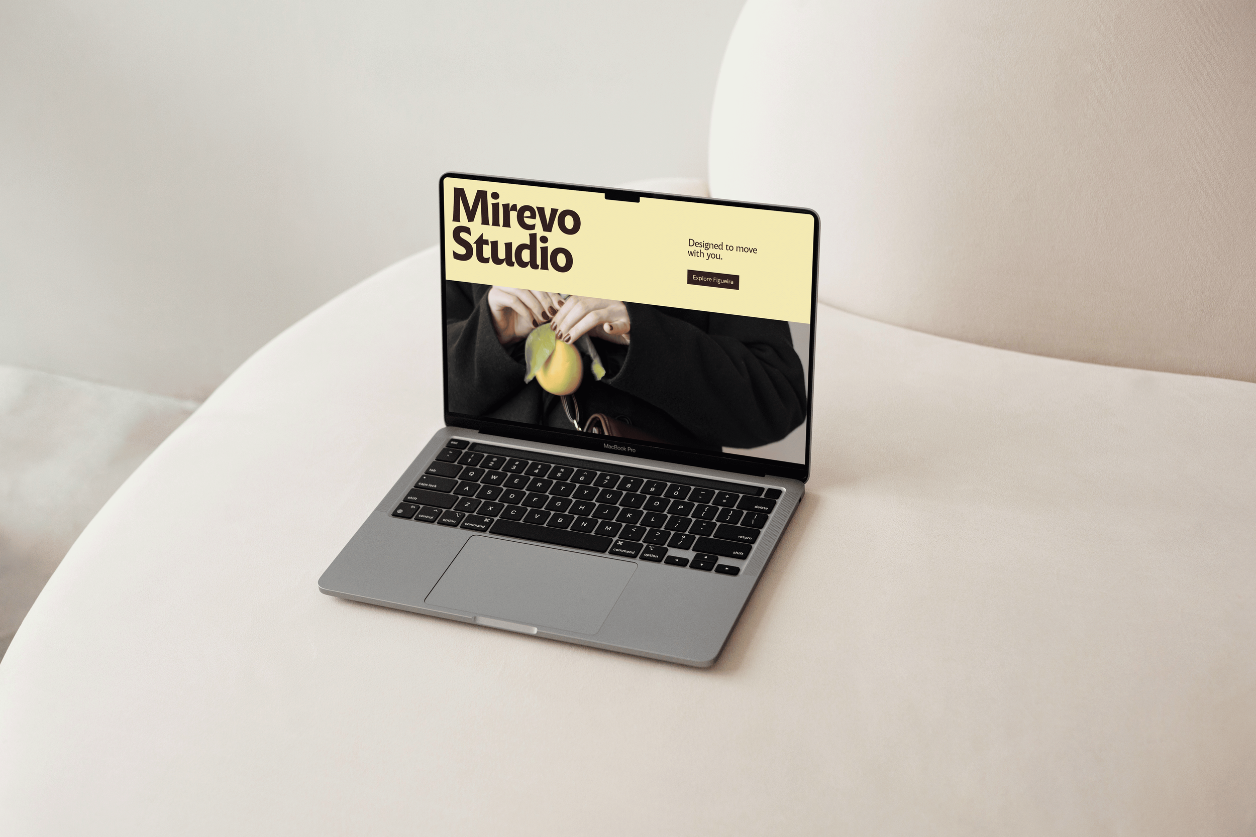
THE MOVEMENT = THE BRAND HAS TO LIVE SOMEWHEREOn a website. In someone’s hands. On packaging. On a sign. In a social post. In a room. This is where you find out whether the identity actually works beyond the moodboard.
This is interesting because you’re taking something that, at first, might only exist as an idea, a feeling, or a business plan and slowly giving it a language, a personality, and a form.